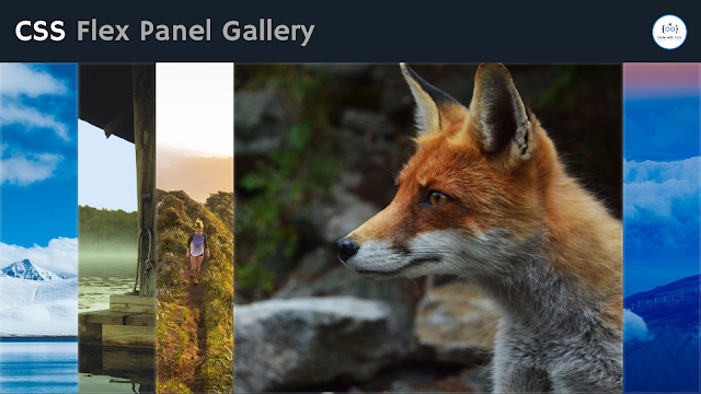
Create Flex Panel Gallery using HTML CSS & JavaScript
This TechSheet will teach you how to create a flex panel gallery. Anyone can create a flex panel gallery with basic HTML, CSS, and JavaScript knowledge.
Flex panel gallery is a CSS project for beginners. After reading this post you will know basic HTML tags, and some important CSS properties such as margin, padding, box-sizing, display, justify-content, align-items, flex-direction, height, min-height, flex, background-image, box-shadow, transition, etc.
Besides, you will learn how to make responsive using CSS @media.
In this post, I'm going to show you how to create a flex panel gallery using HTML, CSS, and basic JavaScript code.
Let's Coding!
HTML
Add this HTML code to the index.html file.
<!DOCTYPE html>
<html lang="en">

<head>
    <meta charset="UTF-8">
    <meta http-equiv="X-UA-Compatible" content="IE=edge">
    <meta name="viewport" content="width=device-width, initial-scale=1.0">
    <title>Flex Panel Gallery</title>
    <link rel="stylesheet" href="./style.css">
</head>

<body>
    <div class="panel_wrapper">
        <div class="panel panel1"></div>
        <div class="panel panel2"></div>
        <div class="panel panel3"></div>
        <div class="panel panel4"></div>
        <div class="panel panel5"></div>
    </div>

    <script src="./script.js"></script>
</body>

</html>
CSS
Add these Styles to the style.css file.
*,
*::after,
*::before {
    margin: 0;
    padding: 0;
    box-sizing: border-box;
}

.panel_wrapper{
    display: flex;
    justify-content: center;
    align-items: center;
    min-height: 100vh;
}

.panel{
    flex: 1;
    height: 100vh;
    background: #4b87cf center/cover;
    box-shadow: inset 0 0 0 5px rgba(255, 255, 255, .1);
    transition: flex .7s ease-in-out;
}

/*===== After clicking on each panel =====*/
.panel.open{
    flex: 5;
}

/*===== Add background image to each panel =====*/
.panel1 {
    background-image: url(https://source.unsplash.com/gYl-UtwNg_I/1500x1500);
}

.panel2 {
    background-image: url(https://source.unsplash.com/rFKUFzjPYiQ/1500x1500);
}

.panel3 {
    background-image: url(https://images.unsplash.com/photo-1465188162913-8fb5709d6d57?ixlib=rb-0.3.5&q=80&fm=jpg&crop=faces&cs=tinysrgb&w=1500&h=1500&fit=crop&s=967e8a713a4e395260793fc8c802901d);
}

.panel4 {
    background-image: url(https://source.unsplash.com/ITjiVXcwVng/1500x1500);
}

.panel5 {
    background-image: url(https://source.unsplash.com/3MNzGlQM7qs/1500x1500);
}

@media only screen and (max-width: 574px) {
    .panel_wrapper {
        flex-direction: column;
    }

    .panel {
        height: auto;
        width: 100vw;
    }
}
JavaScript
In JavaScript, we will use querySelector to select all panel elements of the index.html file. Then we will use a forEach method to add a click event to every single panel using addEventListener.
Then we will create a toggleOpen() function to add an open class to all panel elements. Here we will use the toggle() method on classList.
Add this JavaScript code to the script.js file.
Then we will create a toggleOpen() function to add an open class to all panel elements. Here we will use the toggle() method on classList.
Add this JavaScript code to the script.js file.
// Select all panel
const panels = document.querySelectorAll('.panel');

panels.forEach(panel => panel.addEventListener('click', toggleOpen));

function toggleOpen(){
    this.classList.toggle('open');
}
CSS Flex Panel Gallery Using HTML, CSS, & JavaScript on Code with Rahi
Watch this on Code with Rahi YouTube channel. Let me know your opinions below about this CSS flex panel gallery!
If you find it helpful as a beginner don't forget to SUBSCRIBE for more videos on web design!


%20Rahi.jpg)


